Learning curves
The mean squared error (MSE) metric is chosen as the loss function: MSE = \frac{\left|(y – yhat))\right|}{N}
… and the mean absolute percentage error (MAPE) is chosen as an additional metric: MAPE = 100 *\left|(y – yhat) / y)\right|
where y are the true output labels, yhat are the predicted output labels, and N is the number of examples. Curiously, tensorflow do not normalize the “mean” absolute percentage error by the number of examples, suggesting that this may vary with numbers of examples in the dataset under examination.
The plots below show the variation of each of these metrics, for each neural network architecture tested, over the three epochs they were trained for, on the training and validation datasets.
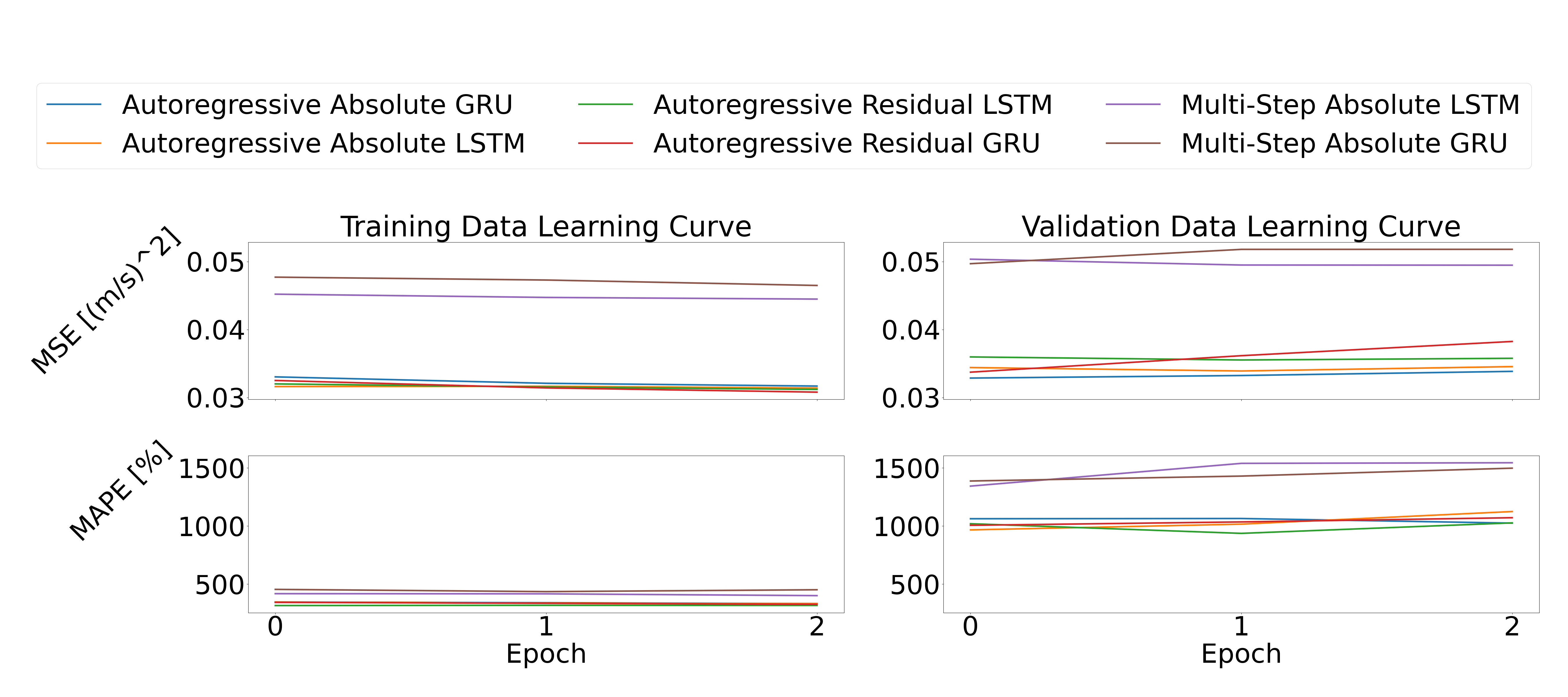
The training data certainly shows a gradual decrease in the MSE over the three epochs for all models, but the MAPE does not seem to decrease with it. The multi-step absolute LSTM and GRU models perform notably worse than the autoregressive counterparts. As for the validation data, both the MSE and the MAPE seem to increase slightly over the training epochs, suggesting that overfitting is occurring. We can see that the multi-step models also perform significantly worse than the others on the validation data. Judging by the difference between the metrics for the training and validation data, for MAPE in particular, results may be improved by including dropout layers and/or pruning the models.
Prediction accuracy
The plots below compare the final mean-squared error and mean absolute percentage error metrics for the training, validation, and testing datasets for each model. The MSE values suggest that the autoregressive absolute GRU/LSTM and the autoregressive residual LSTM result in the least error. However, it is more difficult to decrypt the MAPE results. For the most part, they are consistent with the MSE values in terms of the models with the lowest loss values, but not always. For example, the validation set for the autoregressive absolute LSTM model is higher than the autoregressive models, which is not true for the MSE of the same model. Further investigation is warranted to understand why the MAPE a) is so large, with the validation datasets having an error of over 1000% and b) why they do not always correlate with the MSE values.

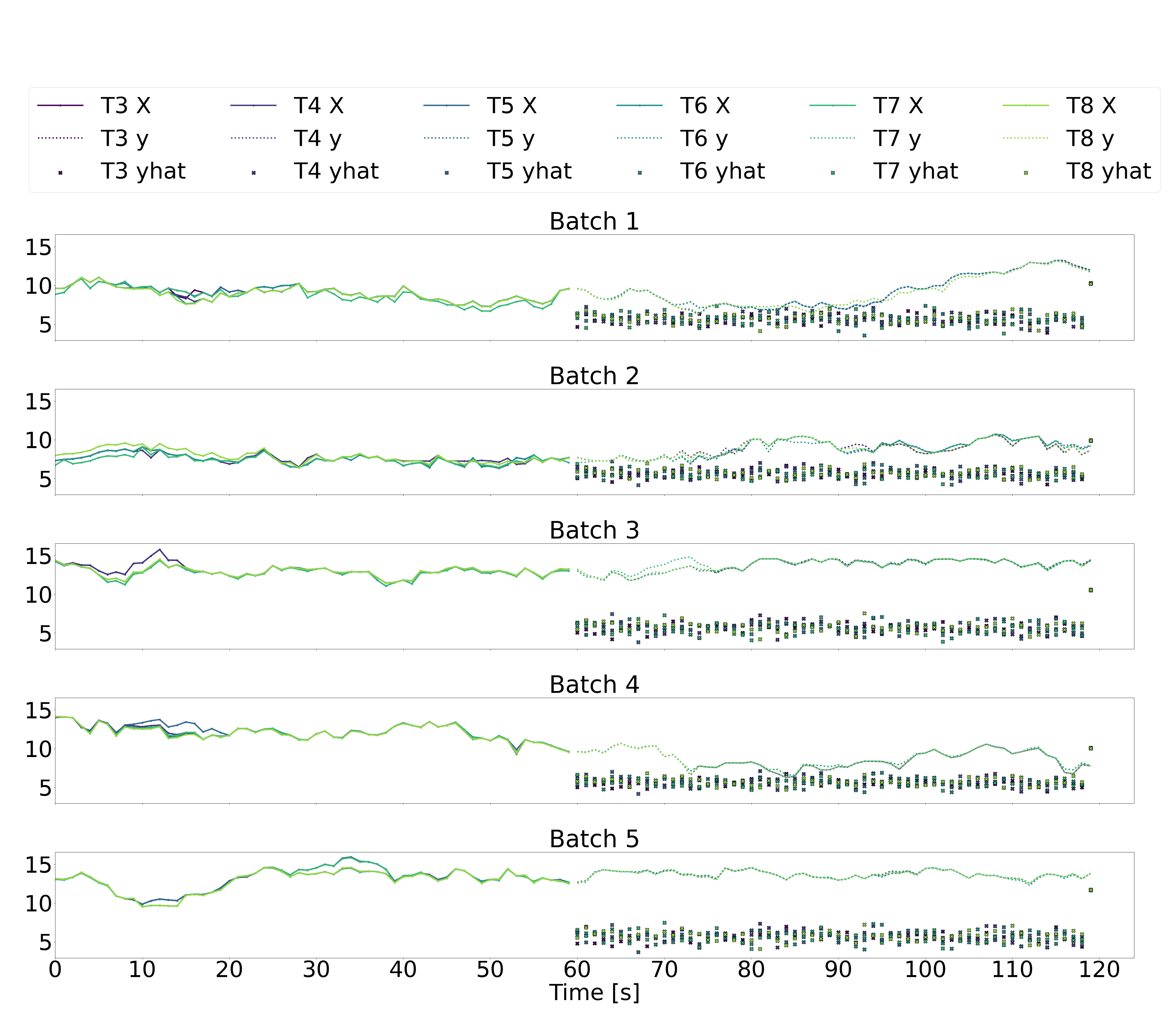
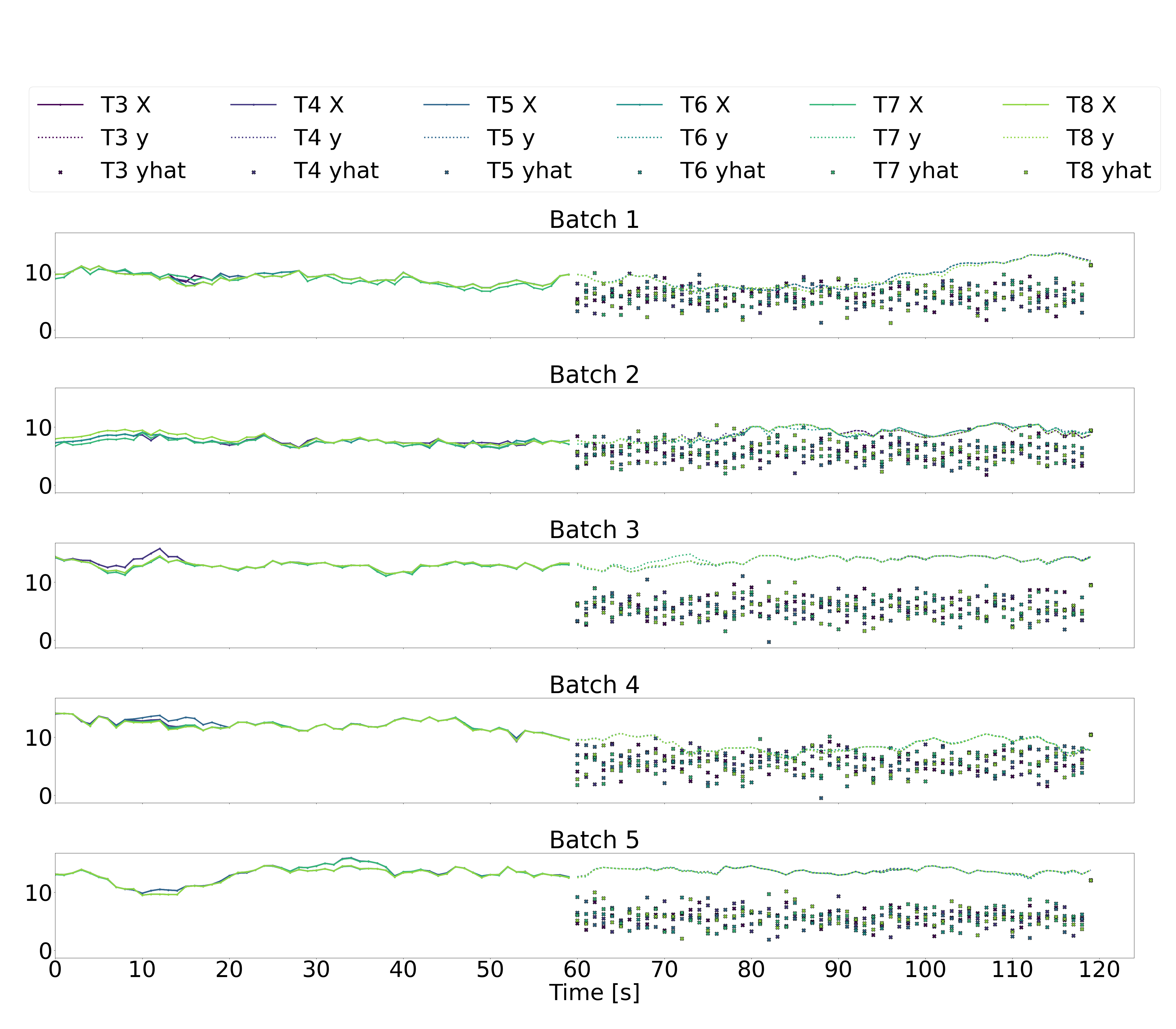
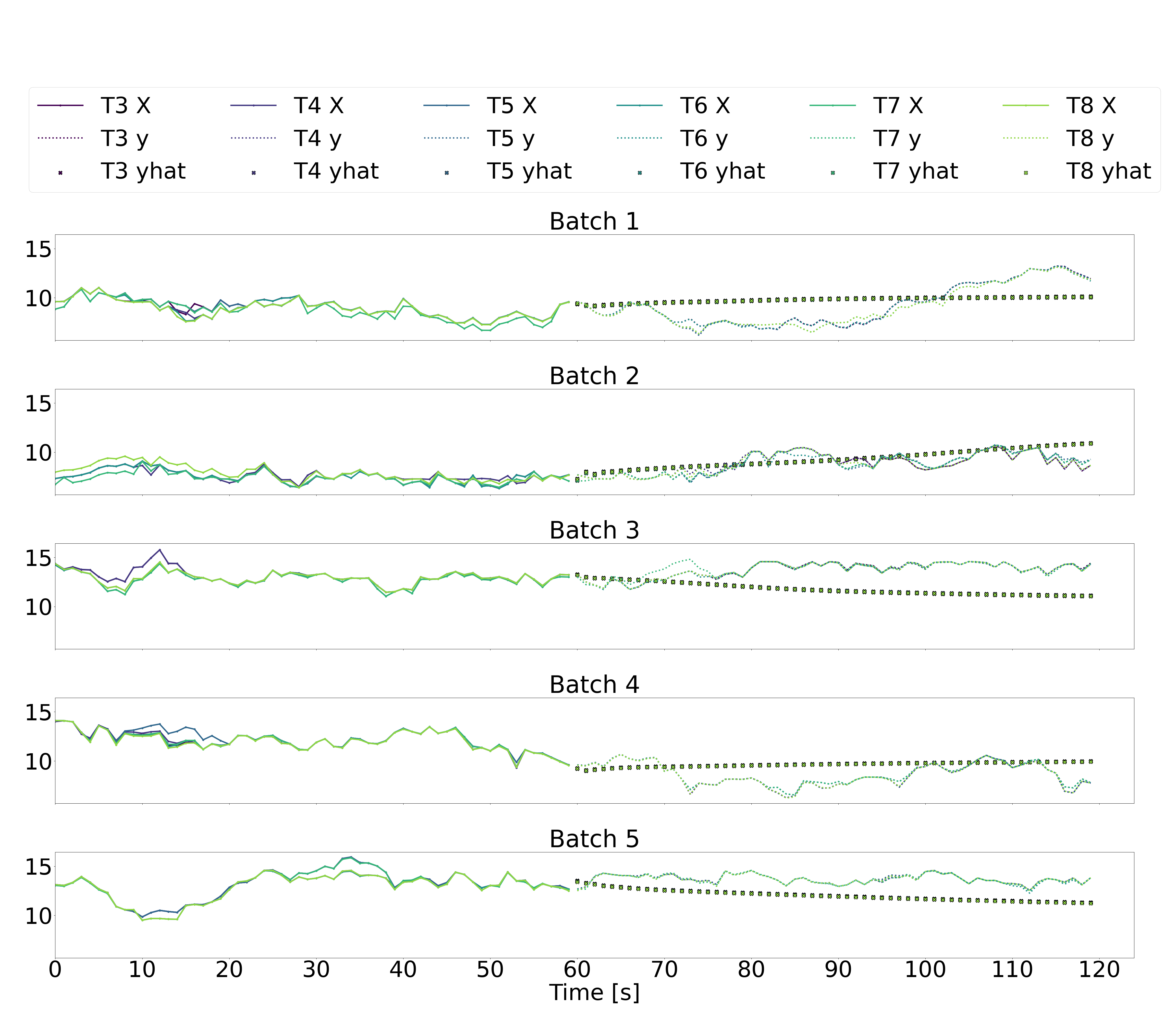
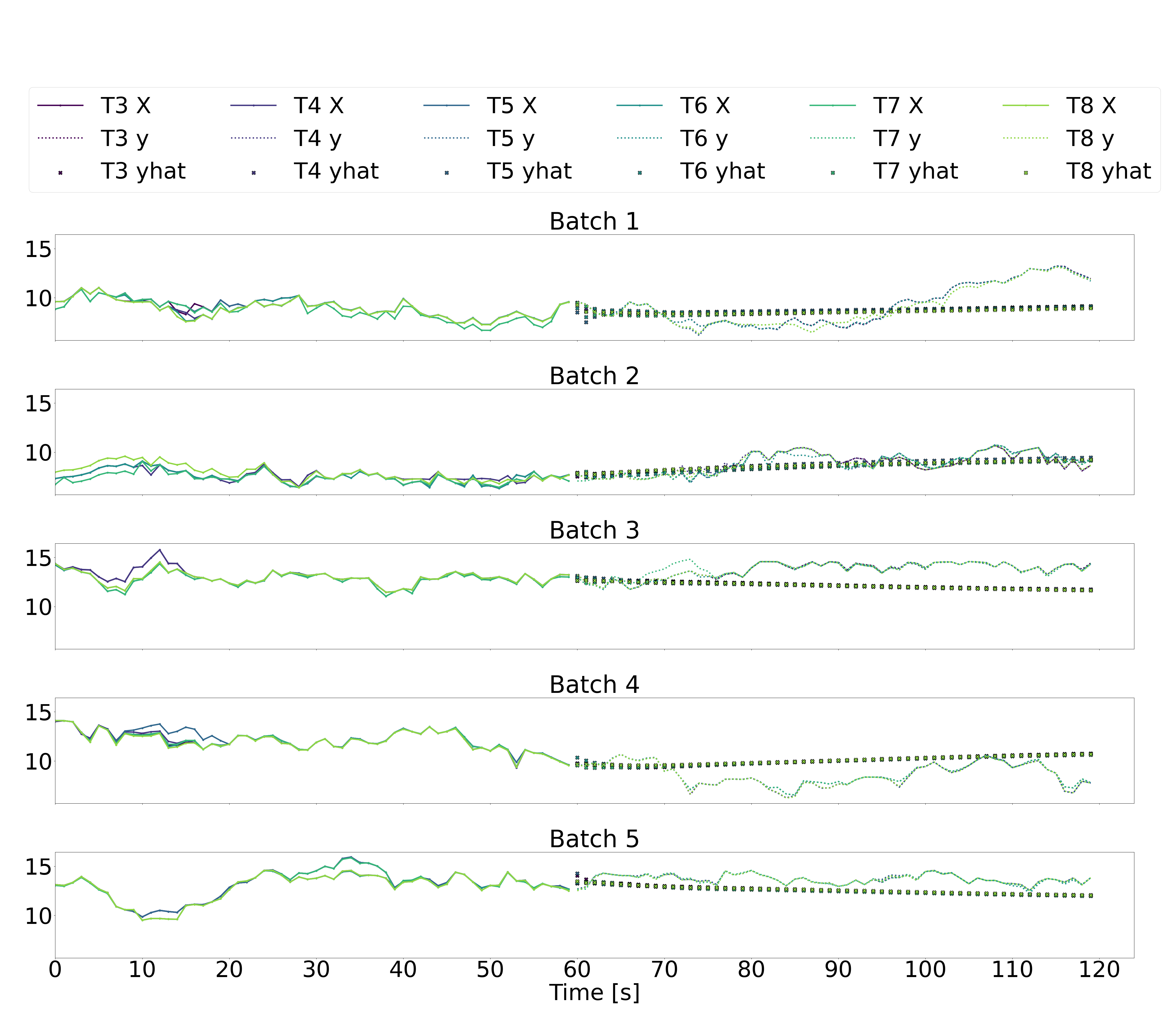
Time-Series Labels vs. Predictions
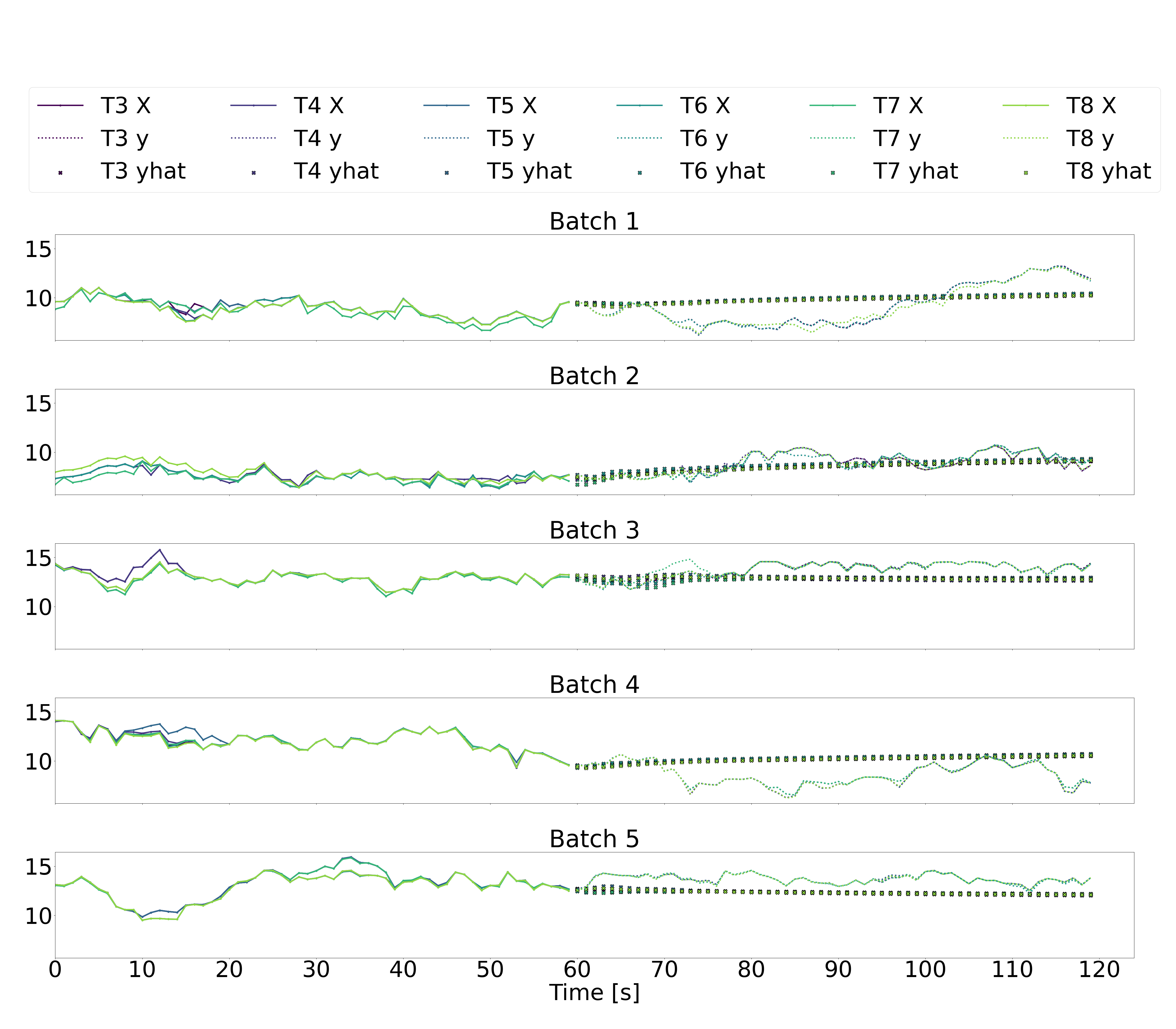
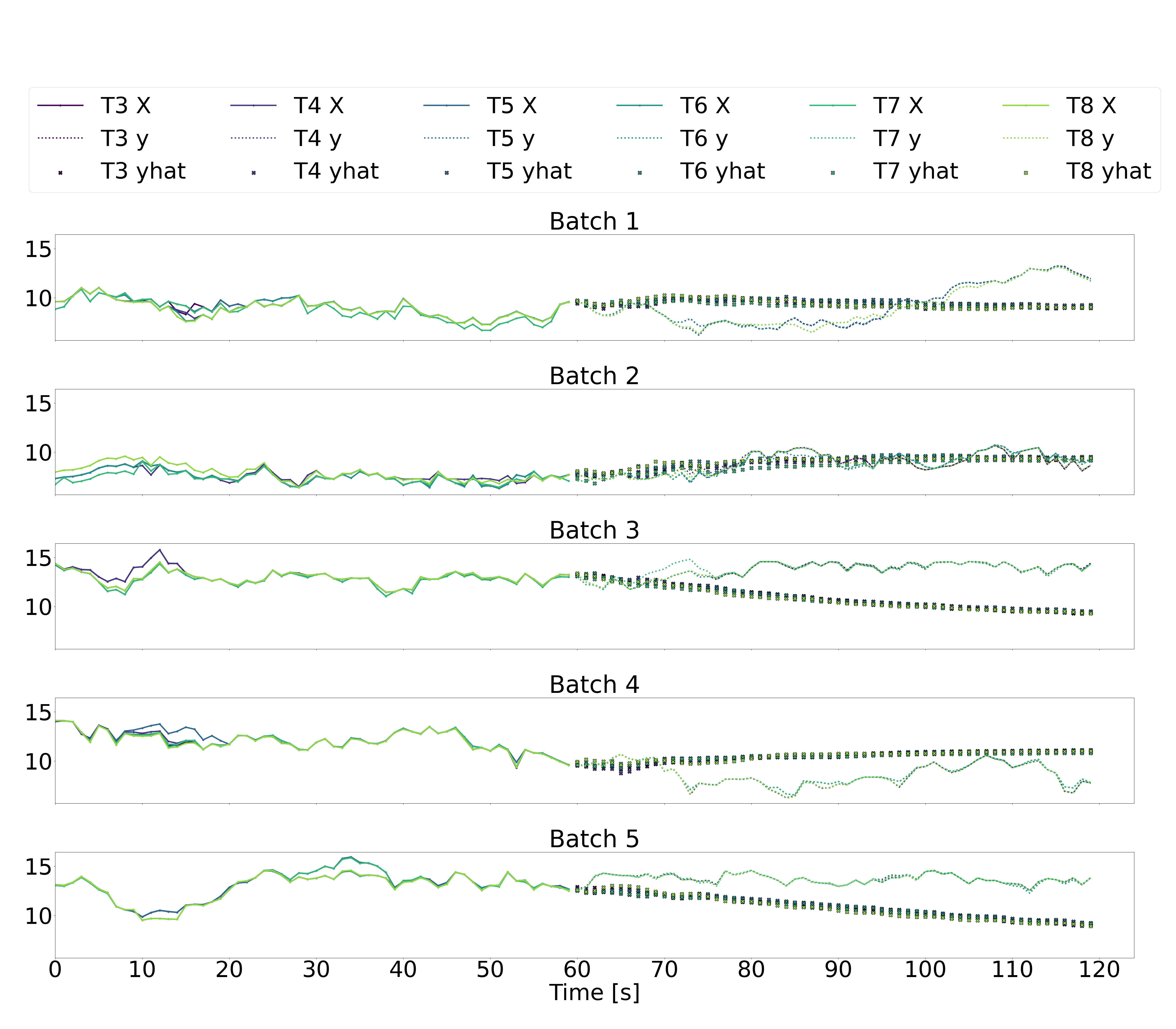
Illustrated below are five batches of 120 sequential seconds of downstream wind turbine speed data, where T3-T6 represent the six downstream wind turbines, X represents the downstream wind speeds in the input data over the historic time horizon of 60 seconds (recall that the input data also includes yaw angles and freestream wind speeds, but we just plot the downstream wind speeds here), y represents the downstream wind speeds in the output labels over a future horizon of 60 seconds, and yhat represents the downstream wind speeds in the output predictions over a future horizon of 60 seconds.
The multi-step LSTM and multi-step GRU architectures (plots 1 and 2 below) produce noisy predictions that don’t seem to follow the trends of the output labels at all. This suggest that generating 60 seconds of future data in a single prediction based on 60 seconds of previous data is not a reliable approach.
As for the autoregressive absolute LSTM and GRU architectures (plots 3 and 4 below), there is significantly less variation in the second-to-second predicted outputs. While the predicted values don’t seem unreasonable, they still don’t appear to follow the trends in the true outputs. The autoregressive residual LSTM and GRU architectures similarly result in predictions that don’t seem to follow the true trends.
Looking at these time-series plots, it appears that a naive prediction strategy of assuming that the most recent output remains constant over the future time-horizon of 60 seconds would result in more accurate predictions than any of our models. This is, clearly, a disappointing result. However, we hypothesize that if we consider the autoregressive models, the addition of some dropout layers, some tweaking of the number of activated neurone via pruning techniques, and some debugging of precisely what is being penalized in the loss functions, we may succeed in generating better predictions.